NHS111. We have a problem.

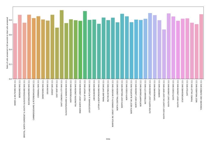
NHS111. We appear to have a problem.Attached is my graphic that in effect shows how likely it has been that your call would have been answered (and therefore presumably a ring tone) in 60 seconds (the target being 0.95). This does not include calls abandoned through waiting. The second image is a snapshot from NHS111’s own statistical report, which appears to document a decline. An important point is that we need this system to work if it is part of the formula to take pressure off GPs and A and E departments. I don’t think that this is anything that the NHS doesn’t already know. I’m just presenting it in a different way. For those interested, the data source is the latest NHS111 data set analysed using Pandas/Python and the display is using Seaborn with matplotlib.

31417060_10156283470854496_7986981789925113856_o

New book on King Alfred – making progress!

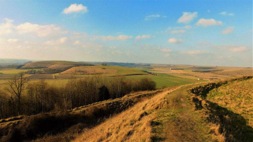
It started as a simple idea, which soon mushroomed into something bigger than I had expected. The idea for the book came from working out for myself the locations of sites associated with King Alfred, then visiting them and finding that there was nobody else there! Bearing in mind the interest in the Anglo-Saxons in general, and King Alfred in particular, this seemed to make no sense! It seemed to me that the problem was partly down to information on relevant sites not being readily available. Additionally, accurate locations for some historical events have not been established (e.g. the Battle of Ashdown) so it is easy to sink in a sea of alternative ideas or theories. A further problem that I came across was what today we might call mis-information (or even fake news?) Perhaps often well-intentioned, but over the past few centuries it appears that many places have wanted a slice of King Alfred, even if it means being over-optimistic with regard to the evidence.

I have tried to cut through all of this to produce something that facilitates better engagement with arguably our most important king by visiting locations that are associated with him. Where the location cannot be established, I put forward alternatives and invite the reader to engage in balancing the evidence.

Hopefully the book will be out some time later this year. In the mean-time, you can keep up with developments on the web-site and blog.

DSC_2741
The statue of King Alfred in Wantage, Oxfordshire

A National Park for Dorset

DSCN0023

Headlines in today’s newspapers, including here,  draw attention to a revelation to be made today by Michael Gove about National Parks. Some of you may know that I support the creation of a new National Park for Dorset, and that hard work is being done to lay the foundations for this. In my opinion, National Park status would allow us to better tailor development to the needs of the population whilst protecting our important green spaces, magnificent landscape, world-famous coastline, and Areas of Outstanding Natural Beauty. I have also written on the theme of the impact of green spaces on public health, including mental health, and I am pleased on one hand to say that this subject appears to get more attention as time goes by, but on the other hand I am unhappy as this does not appear to translate into policy on the ground. With respect to planning applications, no health body is consulted other than for the largest developments. As a result the potential health impact of loss of green space does not get flagged up (and nor does any rise in exhaust particulates and nitrogen oxides where increased traffic volume or congestion may occur). My writing from 2016 can be read here.

There is also something to be said about the economic case. Others have worked harder on this, but it is apparent to me that the economy in Dorset is not what it could or should be. In contrast to the perceived fears by some that a National Park could mean more bureaucracy, I see it as a huge opportunity for business development, innovation and enterprise. Let us not forget that Weymouth and Portland have been reported to have the lowest wages in the country. The National Park could be the rescue package that the county needs.

Please have a look at the Dorset National Park Website.

Image ©Danielle Wootton


Health and crime

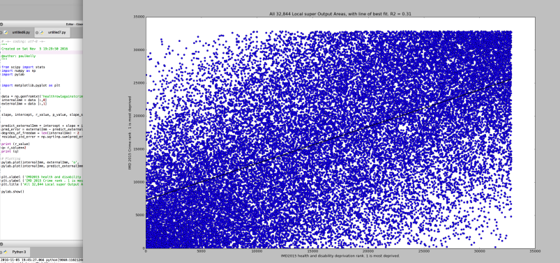
Just a quick look (can’t resist looking at data!) at some data from the Index of Multiple Deprivation 2015 components. The data used are rankings across all 32,844 LSOAs (basically the individual geographical units across England).

Note: when I tried to replicate this from a spreadsheet, it froze my fairly powerful computer. Perhaps best not to do this sort of thing with Excel or numbers!

screen-shot-2016-11-05-at-19-51-39

This sounds tedious, but it can be done in seconds in Python.

The black line across the image is nothing more than a line of best fit for all 32,844 points. The R2 (2 should be superscript) value is an indication of correlation. 1 would be perfect correlation. i.e. all dots perfectly on the line. What we have here is 0.31, which is something but not a strong correlation. However, you will still see visually clumping at either end of the line and also at the extremes. It is suggestive that even though overall the correlation may not be super strong, at extreme positions a relationship between health deprivation ranking and crime ranking is present.

The Political Cage of Contradictions

Like others, I suspect, I use my blog sometimes as a mind dump of concepts that I don’t want to forget about, but which I am also happy to share.

In this posting “dialectic” refers to a tension between two poles. You can substitute “contradiction” with little loss of meaning. There is much more to dialectics, but I am not going into that here. I have a useful summary in my PhD thesis.

I was reminded recently of the dialectic between equality and democracy. It is quite simple to understand when put bluntly. Modern societies impose a limit on democracy. This is because there are more poorer or moderately well off people than there are very rich and powerful people, and complete democracy would result in a vote to strip or curtail the very rich of perceived undeserved money and power. Complete democracy will therefore not be permitted by the very rich and powerful. As an aside I suggest that a complete democracy would accommodate a range of inequalities. For example, particular skill or hard work might attract additional financial gain as this would be seen as just.

We then have the additional dialectic between equality and liberty. For me, this was perhaps best expounded in the works of Isaiah Berlin, although other authors have written about this. The point is that if we were to move from the vastly unequal society that we have now, to a much more equal society, there will be deprivation of liberties at some points in our society. Liberty to produce goods and benefit from the proceeds would not apply at all levels. Of course, we have an element of this already with taxation systems. Equality, at its extreme, would need to be imposed and robustly controlled. People are different, both biologically and in ambition. A huge state apparatus would be required to operate this. And would there be confidence that the state could carry this out correctly, objectively, and without excess transfer of power to itself and its operatives? Who would control and monitor that state? So here we see that we have moved into the dialectic between small and large state apparatus.

Where it gets even more fascinating is when we try to bring together the 3 dialectics of equality and democracy, equality and liberty, and small and large states. Equality fits with an expansion of democracy, but also with a restriction of liberty, and with the development of a large state. But what if we try to look at the potential relationship between state apparatus size and democracy. I think here we are getting right to the kernel of what politics is about. Everything changes according to the priorities you use in the choices that you make. Equality comes at a price. Democracy comes at a price. Even liberty comes at a price (the rich would have the liberty to use their money as they wished and not pass money to the poor through taxation).

It seems to me that the first extreme that fails a sense of natural justice is liberty as the very rich and powerful benefit excessively over the rest of us. A trade off on liberty for reduced inequality is, I think, justified.

The next extreme that fails the test is equality. The loss of liberty and the size and pervasiveness of the  state apparatus required to impose and maintain this would not be compatible with democracy. In fact, the condition would negate democracy, as power would no longer lie with people, whether or not through their representatives,  but with the state apparatus.

This leaves us with democracy. It seems to me that those with most to lose from an expansion of democracy are those with excessive power and resources. Representative democracy as it stands protects those interests. I therefore support an expansion of democracy. By this I mean greater use of referenda and a radical increase in transparency and accountability at all levels of society. I think it is important to recognise political parties and movements that are heading in that direction. I believe that is where things are heading and indeed, I think that is the best option for our future.


If you made it to the end, thanks for taking the time to read this.


Why both the Left AND the Right are wrong

It seems that our societies are hooked on a left/right paradigm that does not necessarily represent where politics is now headed. Just yesterday I watched the Pirate Party (Icelandic) on TV explain that they were neither right nor left. Yet I see in today’s Guardian that this party is described as leftist. Why this obsession with applying labels? It might be argued that it is a simplification that aids understanding. However, I argue that the simplification is so great that utility is often lost. Perhaps more importantly, parties are labelled for you as leftist or rightist by editors and journalists and this is served up in your media as fact. Furthermore, the paradigm assumes that politics is on a single left-right spectrum, whereas it is more likely that parties vary along multiple spectra.

A further flaw of the single spectrum approach is that it is a circle and not a line. What I mean by this is that far right melds into far left. Was Stalin far left or far right? You decide. Or was there a problem with the paradigm, even then?

I argue that instead of simplification the left/right approach is capable of sewing confusion. Earlier signs of a problem were the “red tory” and “blue labour” approaches. Even Blair’s (and Giddens’) “third way” is, in my opinion, a symptom of paradigm failure. What, in my opinion, the authors and creators of these concepts did not understand was that they were painting on the wrong canvas. For example, a third way only makes sense if there were only two previous ways, which of course is a nonsense.

The left/right paradigm also militates against a shared understanding and co-operation between politicians and citizens with differing ideas. This is because it is set up as an opposition. But perhaps even more importantly it excludes those who feel that they cannot align themselves to some point on the left/right spectrum, perhaps another sign of the failure of the paradigm.

And here I can start to conclude with something personal. To those of you who may have tried to work out whether I am left or right, and have managed to arrive at a conclusion, I can tell you that your conclusion is wrong. I cannot align with the paradigm. Over my life I have voted every which way, and spent much of it wondering where I sat. I suspect there are many reading this and feeling similar. But it’s not you that has the problem. The problem lies with the batching of ideas and the allocation of these to the ends of a false single spectrum, and all of this done by somebody that is not yourself.

I suppose by inclination and education I am more of a scientist  than anything else. Party politics as it is currently undertaken involves two things that clash in a major way with this. Firstly, party politics means that you align with the policies of the party even if you think some of them are wrong (hence “whipping”). Secondly, and in my opinion really important, is the inflexibility with respect to changing policy when new evidence arises. In science, it is expected that things will be challenged and tested and progress will ensue. Party politics seems to embody the opposite of this i.e. entrenchment.

I hope in this article to have raised awareness. Ideally, we should abandon the outdated, failing and ridiculously over-simplified left/right paradigm. But it would be a start if we tried to disregard it.

Transferring financial data visualisation tools to health data analysis

An interesting financial tool that I believe can be better exploited for public health purposes.

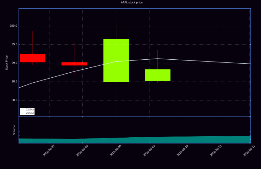
I may be missing something, or perhaps may have been looking in the wrong places, but it seems to me that financial analysis tools can be used more in health and public health analysis. To illustrate this I have created a display of the Apple share price with some analysis. The method used here is Candlestick analysis (there are also 2 moving averages on the chart).

screen-shot-2016-10-10-at-22-03-55


Here is a close up of a part of the graph to help you see.

screen-shot-2016-10-10-at-22-04-44

The rectangles (the candlesticks) have 4 values, these being opening price, closing price, high, and low (the high and low represented by the vertical lines projecting up and down out of the rectangles. The chart at the bottom is just corresponding volume data.

Below shows a close up of a candlestick to better show the vertical lines (representing the high and the low). The line running across is the moving average. One date appears twice only because I have zoomed in so far that it has filled the space. What I can’t show you is that you can get interactive feeding back of coordinates and dates by mousing over the chart.

screen-shot-2016-10-10-at-22-29-56

Now, why am I suggesting this for health data? Well it strikes me that in some circumstances 4 values apply. Let’s take malaria. In a particular country, each week will have a start number of cases per day (the value for the last day of the previous week), an end value, (last day of the week) and a high and low for the week. Why would we not use a normal linear graph? The advantage of the candlestick method is that effectively one creates another dimension to record data. The fluctuations over a week are captured in a candlestick in a way that you may not home in on with a linear graph where there is a large amount of data over a period of time.

The volume data could be used to record fatalities (for example)

I have certainly got this method on hold as another tool in the toolbox!

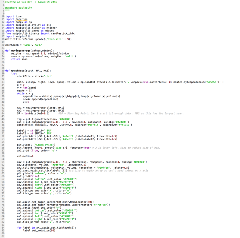
The underlying Python code (well as much as I could get in the screenshot!) is displayed below. Some credit must also go to Harrison over at Sentdex who taught me (and I expect many others) pretty much everything I know (so far) about matplotlib.

screen-shot-2016-10-10-at-22-05-55


Population data

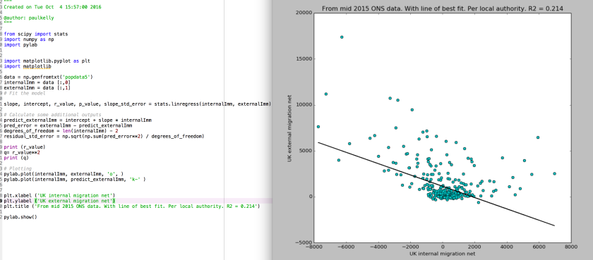
I thought it would be interesting to look at population data re. net internal and external migration in the UK. A cursory glance at the data suggested an association between high net external migration and high net internal migration. This exercise underlines the importance of data analysis because to a significant extent I was wrong. Although there is a small trend in this direction, and it certainly appears to be true for some places, the correlation value is actually quite low. The line on the chart is no more than a calculated line of best fit between the dots.

screen-shot-2016-10-09-at-17-37-42


Addendum: Just did again with data calculated as per capita. Slightly stronger association, but with R2 being still only around 0.25 (so therefore still weakish although, again  clearly applying in some places). Please note that census data, and other inputs, are not 100% accurate.

Dental caries experience is skewed

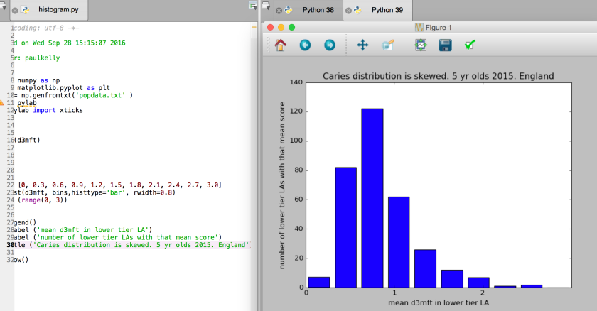
Just a simple demonstration of how dentalcaries experience is skewed (i.e. not a “normal distribution”) across lower tier local authorities. As a reminder dmft is the SUM of decayed AND missing AND filled teeth. The ‘3’ stands for under light without using a probe or observing radiographs. Source is the 2015 national survey of 5 year olds for England.

screen-shot-2016-09-28-at-16-00-44

The imprecision of population data


It is, in my opinion, vital that those using population data (health, housing etc, etc. understand that the published figures are not precise. Please read the wording in the image or click the link. The  distance between the stated figures and the 95% confidence level either way (plus or minus) is not insignificant. This means that the national and local populations cannot be precisely established. This, for example, could be important where the data suggest that your local population has gone up a bit, whereas in fact the changes may be less than the margin of error, leaving us all uncertain as to what the actual picture is. The 2011 census is an input into the annual mid-year population estimates, so nor are these free from that problem.

http://webarchive.nationalarchives.gov.uk/20160105160709/http://www.ons.gov.uk/ons/guide-method/census/2011/census-data/2011-census-user-guide/quality-and-methods/quality/quality-measures/confidence-intervals/index.html


screen-shot-2016-09-27-at-11-59-37